Guide: Rocks, the interface editor
Rocks is the interface editor for UXKit. You lay out a window in it, connect
the controls to your classes, and save the result as a .rsc file. Your app
loads that file with UXRsc and gets the
window back, with its outlets set and its actions wired. Rocks is written in
xc on UXKit. From 0.7.
This page describes each part of Rocks. To build something with it step by step, see the tutorial.
Getting Rocks
Section titled “Getting Rocks”Rocks is in the repository under apps/rocks. On macOS, build and start it
with:
XCC=/opt/xcc/0.7/bin/xcc sh apps/rocks/run_rocks.sh [file.rsc]The first run builds the AppKit shim and Rocks; later runs rebuild only what
changed. --build-only builds without starting it.
Rocks is an ordinary UXKit app, so it builds for the other backends too (see the driver model). Everything on this page works on macOS. On Linux (GTK) and Windows it works from 0.71. In a browser it works from 0.71 too, except the right-click menu and dropping files onto the window; use Delete on the toolbar instead.
The window
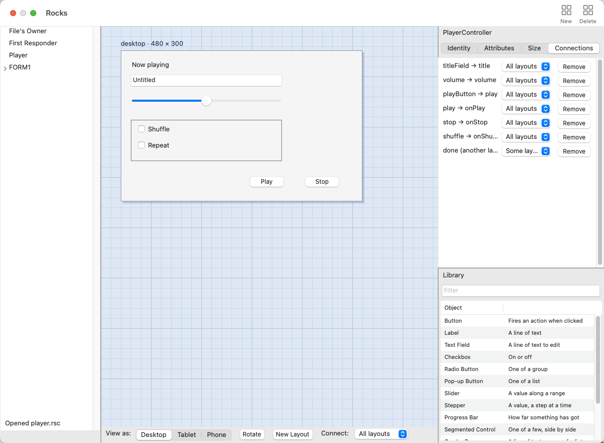
Section titled “The window”| Part | What it holds |
|---|---|
| Outline (left) | File’s Owner, First Responder, the document’s objects, then each form with its controls. Click a row to select it. |
| Canvas (centre) | The form being edited, on a grid, labelled with its layout and size. |
| View as (under the canvas) | Desktop, Tablet and Phone, Rotate, New Layout, and Connect, the scope a new connection gets. |
| Inspector (right, top) | Identity, Attributes, Size and Connections for what is selected. It scrolls when a tab is taller than its pane. |
| Library (right, bottom) | What can be added. Type in Filter to narrow the list. Drag the divider above it to give the inspector or the library more room. |
| Toolbar | New adds a form; Delete deletes the selection. |
| Status line (under the outline) | What the last action did. |
A document holds one or more forms. Each form is one window or dialog. New
adds a form named FORM1, FORM2 and so on, 320 × 200 points, and shows it.
Click a form’s row in the outline to show that form.
To change a form’s size, click its background, then set W and H on the Size tab.
Adding controls
Section titled “Adding controls”Drag an item from the library onto the form. While you drag over the form, the control itself follows the pointer; it is placed centred where you let go. You can also click an item and then click the form.
| Item | Adds |
|---|---|
| Button | A push button |
| Label | A line of text |
| Text Field | A line of text the user can edit |
| Checkbox, Radio Button | On or off; one of a group |
| Pop-up Button | One choice from a list |
| Slider, Stepper, Progress Bar | A value in a range |
| Segmented Control, Combo Box | One of a few; a field with a list |
| Text View | Several lines of text the user can edit |
| Date Picker | A day of the year |
| Breadcrumb | A path, one level a step |
| Table, Outline, Collection View | Rows of data; a tree, one row a level; a grid of items |
| Scroll View | A viewport that scrolls the controls placed inside it |
| Split View | Two panes with a draggable divider; a control’s Slot chooses the pane |
| Tab View | A strip of tabs, each with its own content; a control’s Slot chooses the tab |
| Box, View | A group of controls, with a frame or without one |
| Custom View | A view of a class you name |
| Object | A non-view object of a class you name, such as a controller |
A control dropped onto a box, or moved onto one, goes inside it.
Selecting, moving and deleting
Section titled “Selecting, moving and deleting”- Click a control to select it, or click its row in the outline.
- Drag a control to move it. Drag a corner handle to resize it. While you drag, the status line shows the position and size.
- View > Show Guides shows alignment guides while you drag, and View > Snap to Guides snaps to them.
- To delete the selection, press Delete or Backspace with the canvas active, press Delete on the toolbar, choose Edit > Delete, or right-click the control and choose Delete. A form’s own background cannot be deleted.
- Edit > Undo (⌘Z) and Redo (⇧⌘Z) cover every edit.
The inspector
Section titled “The inspector”Identity shows what the selection is.
- For a control: its Class (empty means the standard UXKit class for its type), its Name, which the outline shows, its Logical id, which connects it across layouts, and the Layouts it is in.
- For an object: its Class and a Label for the outline, then the class’s outlets and actions and the file they were read from.
- For File’s Owner: the class of the object that loads the file.
Attributes holds what the control says and how it behaves: its Text, Disabled, Hidden, and the settings of its type, such as Default and Cancel for a button, Editable and Alignment for a text field, or the range of a slider.
Size holds X, Y, W and H, and the control’s autoresizing: how it follows its container when the window is resized. Tick the margins it keeps (Left, Right, Top, Bottom) and the sizes that stretch (Width, Height). A button in the bottom right corner keeps its Right and Bottom margins; a list that fills the window stretches both ways. With nothing ticked the control stays where it is, pinned to the top left. Autoresizing belongs to the layout being shown, like the position and size.
Connections lists the selection’s connections, each with its scope and a Remove button. Under them, “Not connected here” lists the outlets with no connection in the layout being shown.
Classes
Section titled “Classes”Rocks reads the outlets and actions of your classes from where they already are, so there is no separate file to keep up to date. It finds them in four places:
- UXKit’s own classes, always.
- Your source. Opening a
.rscfile reads every.xcfile in its folder, down to four levels. File > Add Class Source or Library… reads one more file, and so does dropping an.xcfile onto the window. - A built library. Drop a library (
.dylib,.soor.dll) onto the window. Rocks reads the interface the compiler stores in it. - Declarations. For a class Rocks cannot find, Identity offers Add
Outlet and Add Action. These are saved in the
.rscfile.
A class declares its outlets and actions like this (see
UXDesignable):
class PlayerController : Object{ outlet UXTextField* titleField; void onPlay(UXControl* sender) : action { … }}To add a controller to the document, drag Object from the library, then set its Class and Label on the Identity tab. It appears in the outline. When an app loads the file, the loader makes one of these objects.
Connections
Section titled “Connections”An outlet is a variable in a class that refers to a control. An action is a method a control calls when it is used.
To make a connection, drag with the right mouse button (or with Control held) from one end to the other:
- from a control on the form to an object’s row in the outline,
- from an object’s row to a control, or
- from one row to another, such as an object to File’s Owner.
A curved line follows the pointer, and the control under it is framed. When you let go, Rocks lists what fits: the outlets whose type can hold that control, and the actions. Pick one, or press Cancel.
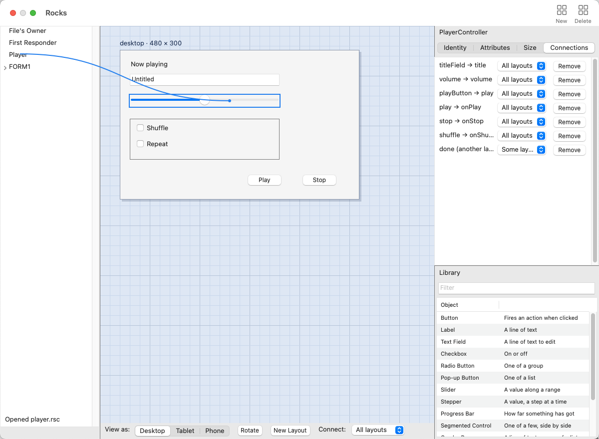
An outlet holds one control in each layout, so connecting it again replaces the old connection. A control fires one action, so the same applies to actions.
Right-click a control without moving the mouse for a menu with Delete and Connections.
Layouts for desktop, tablet and phone
Section titled “Layouts for desktop, tablet and phone”A form can have a separate layout for each form factor, and for portrait and
landscape on a device. All of them are kept in the same .rsc file.
- View as shows Desktop, Tablet or Phone. Rotate switches between portrait and landscape; the desktop has no orientation.
- If the form has no layout of that kind, the canvas keeps showing the one it has and the status line says so. New Layout makes one, starting as a copy of the layout on the canvas at the device’s size: 360 × 640 for a phone, 768 × 1024 for a tablet.
- Each layout has its own positions and sizes, and can leave out a control or add one of its own.
- What a control says is shared by every layout: an edit to its Text, flags or state on the Attributes tab changes every layout. Press Vary beside a property to give the layout being shown its own value. The button then reads Varies; press it again to share the property again.
Connections per layout
Section titled “Connections per layout”Each connection has a scope: the layouts it applies to. Connect under the canvas sets the scope of new connections: All layouts (the default), Desktop, Tablet, Phone, or This layout. The Connections tab changes the scope of an existing connection.
A connection to a control that the layout being shown does not have is listed as “(another layout)”. When an app loads the form, only the connections whose scope includes the device’s layout are made.
File > Open (⌘O), Save (⌘S) and Save As (⇧⌘S) read and write
.rsc files. Dropping a .rsc file onto the window opens it.
A .rsc file from Rocks is a classic GEM resource that any GEM AES can read.
The layouts, classes and connections are stored after the classic data, where
GEM does not look. The details are on UXRscV2.
Loading the file in an app
Section titled “Loading the file in an app”Data* rsc = UXFileIO.read((u8*)"player.rsc");UXRscInstance* design = UXRsc.load(rsc.bytes(), rsc.length(), 0, (UXDesignable*)0, content);This builds form 0 (the first form) for the device the app runs on, makes the
document’s objects, connects them, and sends awakeFromRsc. See
the rsc guide for the details.
Keys and mouse
Section titled “Keys and mouse”| To | Do |
|---|---|
| Add a control | Drag it from the library onto the form |
| Select | Click it on the form or in the outline |
| Move or resize | Drag it, or drag a corner handle |
| Connect | Right-drag or Control-drag between a control and an outline row |
| Open a control’s menu | Right-click without moving |
| Delete | Delete or Backspace, with the canvas active |
| Undo, Redo | ⌘Z, ⇧⌘Z |
| Open, Save, Save As | ⌘O, ⌘S, ⇧⌘S |
On Linux and Windows, Ctrl takes the place of ⌘.