UXRadioButton
UXRadioButton is a checkbox’s sibling with one difference: only one button in
its group is selected at a time. The mutual exclusion is neutral logic in
UXRadioGroup. Clicking a button asks the group to select it,
and the group clears the others. That is all of radio behaviour, so it lives in
the toolkit rather than in seven drivers. The button draws itself from the
theme’s radio / radio.selected sprites on backends without a native radio
idiom, including iOS, because UIKit has none.
#use <UXKit>Overview
Section titled “Overview”UXRadioGroup* dest = new UXRadioGroup();UXRadioButton* email = new UXRadioButton();UXRadioButton* sms = new UXRadioButton();email.setTitle((u8*)"Email");sms.setTitle((u8*)"SMS");dest.add(email); dest.add(sms);email.setSelected(true);content.addSubview(email, UXGeom.make(8, 8, 100, 20));content.addSubview(sms, UXGeom.make(8, 32, 100, 20));The action fires after the group has re-selected, so the handler reads the new state:
void onDest(UXControl* sender) { UXRadioButton* pick = dest.selected(); ...}Conforms to
Section titled “Conforms to”- Inherits
UXControl: title, thecallbackaction (auto-zeroing), the fire path.
Topics
Section titled “Topics”State · isSelected · setSelected The group · UXRadioGroup
isSelected
Section titled “isSelected”bool isSelected(void)Whether this button is the group’s pick.
setSelected
Section titled “setSelected”void setSelected(bool s)Sets the state directly and marks the button dirty. This is the raw state. Code
that wants the group semantics calls the group’s select() instead.
UXRadioGroup
Section titled “UXRadioGroup”class UXRadioGroup : ObjectThe exclusion set. It holds strong references to its buttons. The view tree does too, so ownership is shared, and there is no cycle because the button’s back-reference is weak.
add(UXRadioButton* b): adopts the button into the group.select(UXRadioButton* chosen): selects one, clears every other.selected(): the current pick, or null.
Platform appearance
Section titled “Platform appearance”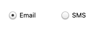
The theme’s radio.selected sprite at its native 21×21, the same Aristo art GEM draws.
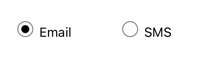
App-drawn, because UIKit has no native radio. The themed sprite draws through the same seam as GEM’s.

A real android.widget.RadioButton. The exclusivity stays neutral (no RadioGroup container): the group clears the others and the model pushes selection back into every native button.

A real radio-style NSButton.

A real BUTTON with BS_RADIOBUTTON.
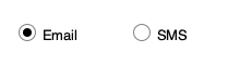
App-drawn. Grouped GtkCheckButtons are the native idiom and are not used yet.

The same themed ring and dot, drawn by the same drawRect.