UXToolbar
UXToolbar is a row of toolbar items (icon-and-label buttons, fixed gaps,
separators) laid out left to right. Two behaviours distinguish it from a
row of buttons. Flexible spaces absorb the leftover width, to push a
group right or centre one between two others. When the fixed items exceed
the width, the trailing ones move into an overflow set, which a native
toolbar shows under a chevron. The layout and hit test are pure geometry,
unit-tested without a window.
On macOS it realizes as an NSToolbar, which is window chrome above the
content area, so it has its own kind. On Win32 it realizes as a native
toolbar control, and on GEM as the app-drawn row.
#use <UXKit>Overview
Section titled “Overview”UXToolbar* tb = new UXToolbar();tb.addItem((u8*)"doc.new", (u8*)"New", 1, 48);tb.addItem((u8*)"doc.open", (u8*)"Open", 2, 48);tb.addSeparator();tb.addFlexibleSpace();tb.addItem((u8*)"search", (u8*)"Find", 9, 48); // pushed to the right edgetb.setAction(&controller.onTool);
void onTool(UXControl* sender) { UXToolbar* t = (UXToolbar* ?)sender; i32 tag = t.itemAt(t.selection()).tag; ...}Topics
Section titled “Topics”Items · addItem · addSpace · addFlexibleSpace · addSeparator · count Selection · selection Overflow · overflow Geometry · layout
addItem
Section titled “addItem”void addItem(u8* ident, u8* label, i32 tag, i16 width)A clickable item. ident names the icon (a native backend maps it to platform
art), label is the text, tag is yours to use, and width is its fixed
extent.
addSpace
Section titled “addSpace”void addSpace(void)A fixed gap.
addFlexibleSpace
Section titled “addFlexibleSpace”void addFlexibleSpace(void)A gap that absorbs an equal share of the leftover width. This one item type provides all of a toolbar’s layout control.
addSeparator
Section titled “addSeparator”void addSeparator(void)A thin rule between groups.
i32 count(void)How many items there are, including spaces and separators.
selection
Section titled “selection”i32 selection(void)The index of the last clicked item, or -1 before any click. A native
toolbar’s click arrives by tag and is recorded here too, so reading it works the
same on every backend.
overflow
Section titled “overflow”i32 overflow(void)How many trailing items did not fit at the last layout. The chevron menu shows these.
layout
Section titled “layout”void layout(i16 width)Places every item: fixed widths first, then flexible spaces sharing the remainder, with trailing items marked invisible when the width runs out. Pure geometry; the tests call it without a window.
Platform appearance
Section titled “Platform appearance”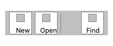
The app-drawn fallback: bezeled items, separators, and a flexible space pushing the last group right.
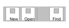
The app-drawn fallback: bezeled items, separators, and a flexible space pushing the last group right.
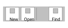
The app-drawn fallback: bezeled items, separators, and a flexible space pushing the last group right.
A native NSToolbar in the window chrome, with traffic lights, title, and icon-above-label items.
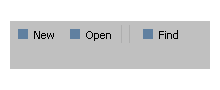
A native toolbar control where realized. The fallback shown draws through the shared seam.
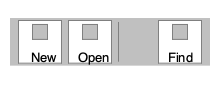
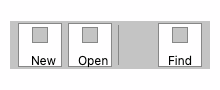
The app-drawn fallback: bezeled items, separators, and a flexible space pushing the last group right.
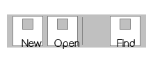
The app-drawn fallback: bezeled items, separators, and a flexible space pushing the last group right.