UXAlert
UXAlert is the only modal thing in the toolkit, and it contains no dialog
code. It is the model (icon, message lines, buttons, the default), and
runModal hands it to the driver. The driver shows the
platform’s own dialog (GEM’s form_alert, Win32’s MessageBox, AppKit’s
NSAlert, the web’s ring round-trip) and returns the 1-based button. The shape
comes from GEM, where an alert is the string
"[icon][line|line][button|button]". This class describes that string in
neutral form.
#use <UXKit>Overview
Section titled “Overview”UXAlert* a = new UXAlert();a.icon = (i32)3; // 0 none / 1 note / 2 wait / 3 stopa.addLine((u8*)"Close without saving?");a.addButton((u8*)"Save");a.addButton((u8*)"Discard");a.addButton((u8*)"Cancel");a.defaultButton = (i32)1; // Return fires iti32 pick = a.runModal(); // 1-based; blocks, modallyTopics
Section titled “Topics”addLine
Section titled “addLine”void addLine(u8* s)Appends a message line.
addButton
Section titled “addButton”void addButton(u8* s)Appends a button, left to right. runModal returns the 1-based index of
the pressed button.
runModal
Section titled “runModal”i32 runModal(void)Blocks modally until the user picks, and returns the 1-based button. The driver draws, tracks and dismisses the dialog, so alerts behave the same from GEM to the web worker.
Fields
Section titled “Fields”icon: 0 none, 1 note, 2 wait, 3 stop. The theme carries art for all three.defaultButton: 1-based. Return fires it. Escape fires the cancel button where the platform has that convention.
Platform appearance
Section titled “Platform appearance”Every platform shows the same model: icon 3 (stop), two lines, Save|Cancel,
default 1, rendered by the driver’s native dialog.
alertRun blocks correctly (the SAB ring’s type-7 reply, covered by the
web-alert gate), but this driver does not draw the dialog yet. The answer
comes from the page, not from a panel.
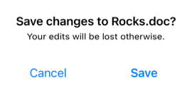
A real UIAlertController behind a nested CFRunLoop, which gives async
iOS the synchronous contract. The default button is the
preferredAction (bold). The last button takes the cancel role.
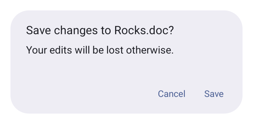
A real Material AlertDialog behind a nested Looper.loop(), the usual
Android shape for a synchronous dialog. Positive is button 1. The negative
button (second from the right) takes the cancel role, following Android’s
convention.
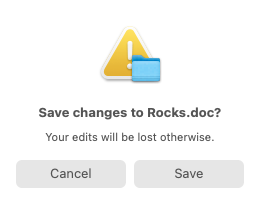
A real NSAlert: caution badge, bold message, informative text, and the
buttons right-aligned. (The window was unfocused when captured, so the
default button’s accent tint does not show.)
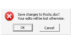
A real MessageBox (MB_OKCANCEL | MB_ICONSTOP). The system fixes
MessageBox’s button labels, so two neutral buttons map to OK/Cancel, and
the result maps back to the 1-based index.
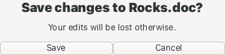
A real GtkAlertDialog behind a nested GMainLoop, which makes the async
choose() synchronous and keeps the neutral button labels.
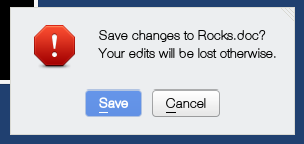
form_alert itself: the themed stop art, the centred panel and the blue
default button, all built by the AES from the model string.