UXSegmentedControl
UXSegmentedControl lays equal-width segments across the control. A click
selects one (single mode, the default) or toggles it (multi mode). It
also serves as the tab picker for a
UXTabView. Layout and hit-test are
pure geometry, unit-tested without a window. Drawing and the click
conversion go through the UXControl seam.
Where the platform has native segment art (macOS NSSegmentedControl,
iOS UISegmentedControl, GTK’s linked toggle group) the driver realizes
it. Elsewhere the control draws one connected bezel with hairline
dividers, because a segmented control is a single control rather than a row of
separate buttons.
#use <UXKit>Overview
Section titled “Overview”UXSegmentedControl* span = new UXSegmentedControl();span.addSegment((u8*)"Day", 0);span.addSegment((u8*)"Week", 1);span.addSegment((u8*)"Month", 2);span.selectSegment(1);span.setAction(&controller.onSpan);content.addSubview(span, UXGeom.make(8, 8, 210, 24));The action fires after a pick lands, and the handler reads the current state from the sender:
void onSpan(UXControl* sender) { i32 seg = ((UXSegmentedControl* ?)sender).selectedSegment(); ...}Conforms to
Section titled “Conforms to”- Inherits
UXControl: theweak:callback action, enablement, the fire path.
Topics
Section titled “Topics”Segments · addSegment · count · labelAt · tagAt Selection · selectSegment · selectedSegment · isSelected · setMultiSelect Geometry · layout · segmentAtLocalX
addSegment
Section titled “addSegment”void addSegment(u8* label, i32 tag)Appends a segment. The tag is yours: a stable id that survives reordering.
i32 count(void)How many segments the row holds.
labelAt
Section titled “labelAt”u8* labelAt(i32 i)The segment’s label.
i32 tagAt(i32 i)The segment’s tag.
selectSegment
Section titled “selectSegment”void selectSegment(i32 i)Takes an index, not a tag. Single mode selects it and clears the others; multi mode toggles it. Programmatic selection does not fire the action.
selectedSegment
Section titled “selectedSegment”i32 selectedSegment(void)The first selected index, or -1 when none is selected. In multi mode, ask each
segment with isSelected instead.
isSelected
Section titled “isSelected”bool isSelected(i32 i)Whether the segment is on. This is the reader to use in multi mode.
setMultiSelect
Section titled “setMultiSelect”void setMultiSelect(bool on)Switches to toggling. Set it before attach where it changes the native realization (Win32 chooses check-group vs check).
layout
Section titled “layout”void layout(i16 width)Distributes equal widths across the row (the last segment takes the remainder). This is pure geometry, and the tests call it without a window.
segmentAtLocalX
Section titled “segmentAtLocalX”i32 segmentAtLocalX(i16 lx)The segment under a local x, or -1 outside. This is the hit-test half of the
same pure geometry.
Platform appearance
Section titled “Platform appearance”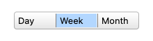
One connected bezel with hairline dividers, the pick filled with the selection colour. The app-drawn treatment, on canvas.
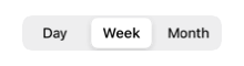
A real UISegmentedControl with the platform’s own segment art. Picks land through applyNativeSelection.
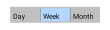
App-drawn. Android’s material segment idiom is a library widget, not a platform one, so the connected-bezel treatment draws through the same seam as GEM’s.

A real NSSegmentedControl.
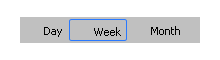
A check-group of BUTTONs, the platform’s segment idiom.
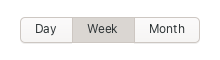
Linked GtkToggleButtons sharing one group, the GTK idiom. The theme fuses them into a single control.

The same connected bezel and dividers, drawn by the same drawRect.
Example
Section titled “Example”A view-mode picker driving a tab view:
UXSegmentedControl* mode = new UXSegmentedControl();mode.addSegment((u8*)"List", 0);mode.addSegment((u8*)"Icons", 1);mode.selectSegment(0);mode.setAction(&controller.onMode);content.addSubview(mode, UXGeom.make(8, 8, 160, 24));
void onMode(UXControl* sender) {    tabs.selectTab(((UXSegmentedControl* ?)sender).selectedSegment());}