UXCheckbox
UXCheckbox is a toggle that remembers. Click it and it flips
isChecked, repaints, and fires its action, like a button that
remembers its state. Where the platform has a native check box (Win32, macOS,
iOS once the overlay lands) the driver realizes one. Where it does not (GEM,
web), the control paints itself from the theme’s check /
check.selected sprites, through the same
drawRect seam as any custom view.
State lives in the neutral object in both cases, so a test can toggle and read
it identically on every backend.
#use <UXKit>Overview
Section titled “Overview”UXCheckbox* c = new UXCheckbox();c.setTitle((u8*)"Subscribe");c.setChecked(true);c.setAction(&controller.onSubscribe); // fires AFTER the togglecontent.addSubview(c, UXGeom.make(8, 8, 120, 20));The action fires after the state flips, so the handler reads the new state from the sender:
void onSubscribe(UXControl* sender) { bool on = ((UXCheckbox* ?)sender).isChecked(); ...}The themed sprite draws at its native 21×21 (stretching blurs pixel art). A disabled checkbox greys its label and consumes nothing.
For the one-of-a-set variant, see
UXRadioButton. It draws the same way,
and the mutual exclusion lives in
UXRadioGroup as plain neutral logic:
select() clears the others, and that is all of radio behaviour.
Conforms to
Section titled “Conforms to”- Inherits
UXControl: title, thecallbackaction (auto-zeroing), the fire path.
Topics
Section titled “Topics”State · isChecked · setChecked Realization · kind · attachTo Events · mouseDown
isChecked
Section titled “isChecked”bool isChecked(void)The current state. The neutral object holds it, whatever realized the control.
setChecked
Section titled “setChecked”void setChecked(bool c)Sets the state programmatically and marks the control dirty. Does not fire the action: actions are for the user’s toggles, and code that sets the state already knows it.
UXKind kind(void)UXKindCheckbox: native where the backend has the art, app-drawn everywhere
else. The driver decides; the control does not know which.
attachTo
Section titled “attachTo”void attachTo(UXViewTree* t, UXRect frame)Realizes into the tree and stores the title (as the node’s spec) and self
(as its peer). A native backend needs both to build a real check box; the
app-drawn path ignores both.
mouseDown
Section titled “mouseDown”void mouseDown(UXEvent* e)Toggle, repaint, fire, in that order, so the action always sees the new state. When disabled, does nothing.
Platform appearance
Section titled “Platform appearance”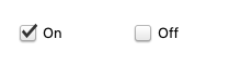
The theme’s check.selected sprite at its native 21×21: the same Aristo art GEM draws, 9-sliced from the same atlas.
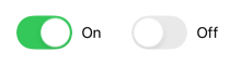
A real UISwitch with its label, the platform’s toggle idiom, captured from the simulator’s render.
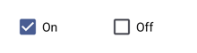
A real android.widget.CheckBox. Its click reports the new state through the bridge, and the peer adopts it before the action fires.
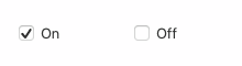
A real check-style NSButton.
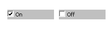
A real BUTTON with BS_CHECKBOX.
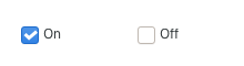
A real GtkCheckButton, toggled through its own signal. GTK draws its own widgets, so this capture is the Linux look wherever GTK4 runs.
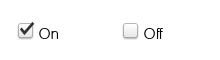
The identical themed sprite, drawn by the same drawRect.
Example
Section titled “Example”A settings row whose apply button reads the toggles:
UXCheckbox* bold   = new UXCheckbox();UXCheckbox* italic = new UXCheckbox();bold.setTitle((u8*)"Bold");     bold.setChecked(true);italic.setTitle((u8*)"Italic");content.addSubview(bold,   UXGeom.make(8,  8, 100, 20));content.addSubview(italic, UXGeom.make(8, 32, 100, 20));
// later, in an action:face.setStyle(bold.isChecked(), italic.isChecked());