UXColorPanel
UXColorPanel is the model behind a colour picker, equivalent to
NSColorPanel in HSB mode.
#use <UXKit> // or #import "UXColorPanel.xc"Overview
Section titled “Overview”UXColorPanel* p = new UXColorPanel();
p.setHue(210); // a slider dragp.setSaturation(200);p.color(); // the UXColor that composes to
p.setColor(UXColor.red()); // an eyedropper or a swatch clickp.hueValue(); // 0 — decomposed back to HSBThe view (the sliders and the two-dimensional field) draws this. The picking state and the conversions live here, and are testable with no window.
Why HSB rather than RGB
Section titled “Why HSB rather than RGB”A colour picker uses HSB because people choose colours that way: this hue, a bit less saturated, a bit darker. Nobody picks a colour by nudging three primaries.
Everything the toolkit draws with is UXColor,
which is RGB. The panel is the bridge between the two, and holds the HSB
state that RGB cannot represent.
HSB is the state, RGB is derived
Section titled “HSB is the state, RGB is derived”This direction is why the class holds fields instead of only converting.
p.setSaturation(0); // grey — hue is now invisiblep.setSaturation(200); // the ORIGINAL hue comes backAt zero saturation every hue is the same grey, and at zero brightness every colour is black. If the panel stored RGB and re-derived the hue, dragging saturation to zero would lose the hue, and dragging back would give whatever hue the conversion picked, usually red.
Holding hue, saturation and brightness separately makes the sliders behave as a user expects: moving one does not silently destroy another.
Integer conversions
Section titled “Integer conversions”Hue is 0–359; saturation, brightness and alpha are 0–255. The
conversions reuse UXColor’s integer HSB↔RGB,
so a panel picks the same colour on every backend and the tests need no
tolerance.
hex() gives the packed value, useful for a text field showing the colour and
for the form a theme file stores.
The panel and the platform picker
Section titled “The panel and the platform picker”A backend uses the toolkit’s own panel when it has no native picker. Where a
platform has a real colour picker
(UXAppKitDriver has NSColorPanel,
Win32 has the common dialog), the driver answers hasNativeColorPanel and the
native one is presented instead.
This class is both the fallback picker’s model and the neutral representation of what a native picker returned. Application code reads it the same way in both cases.
Platform appearance
Section titled “Platform appearance”A colour panel is a model and has no widget of its own. The portrait shows the
model’s two ends: a swatch showing what color() composes to, beside
three real UXSliders at its H, S and B
values.
All seven show the same colour, rgb(64, 150, 220), which decomposes to
H 207/359, S 180/255, B 220/255. The knob positions are set from those
numbers.
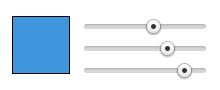
Themed sliders on canvas; the swatch is a plain fillRectRGB of color().
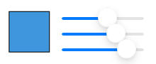
Real UISliders. The filled track left of the knob is the platform’s own, not drawn by the toolkit.
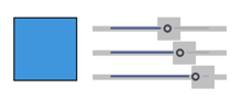
Real SeekBars, with Material’s square thumb.
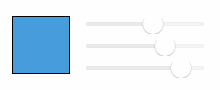
Real NSSlider overlays. On macOS the driver answers hasNativeColorPanel, so a picker would be NSColorPanel; this is the model behind the neutral one.
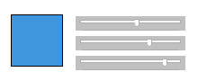
Real trackbars (msctls_trackbar32).
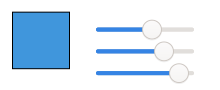
Real GtkScales. GTK draws its own Adwaita widgets, so this capture is the Linux look wherever GTK4 runs.
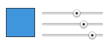
The themed groove and knob, drawn by the same drawRect as the web capture, so the two look identical.
Topics
Section titled “Topics”setColor · color · setHue · setSaturation · setBrightness · setAlpha · hueValue · saturationValue · brightnessValue · alphaValue · hex
setColor
Section titled “setColor”void setColor(UXColor* c)Decompose an RGB colour into the panel’s HSB state. See the caution.
UXColor* color(void)Compose the current state into a UXColor. Returns a fresh colour on each
call, so it is safe to pass to a control that will keep it.
setHue
Section titled “setHue”void setHue(i32 h) // 0..359setSaturation
Section titled “setSaturation”void setSaturation(i32 s) // 0..255setBrightness
Section titled “setBrightness”void setBrightness(i32 b) // 0..255setAlpha
Section titled “setAlpha”void setAlpha(i32 a) // 0..255The conversions carry alpha through unchanged. It is not part of HSB and is held alongside.
Component readers
Section titled “Component readers”i32 hueValue(void)i32 saturationValue(void)i32 brightnessValue(void)i32 alphaValue(void)What the sliders read. These return the stored state, which is why hue survives a trip through zero saturation.
u32 hex(void)The composed colour packed into a u32.
Conforms to
Section titled “Conforms to”- A plain class (not an
Objectsubclass)
See also
Section titled “See also”UXColor: the RGB value, and the HSB conversionsUXColorList: named colours, once one is chosenUXViewDriver:hasNativeColorPanel, which decides whether this panel is shown at all